Why to use Infographic slides in a Presentation
Here we are talking about another tool that helps you giving a killer presentation. Infographic slides are a main part of any presentation, especially that the world are moving for word towards numbers so fast and technical algorithms that support the market.
The reason we use infographics and always looking for infographic templates is to simplify and clarify complex data and turn them into digested information that help deliver a point or make a decision.
Now let’s talk in general about how using infographics will benefit you while presenting, these couple of auto results that you will see their effect clearly.
-
Create a flow of information
Well, it helps the presentation to make sense at the end. The flow information while you are presenting is totally required. Imagine you are having a Pitch Deck presentation, presenting your numbers to convince your audience needs organization and brief.
-
Visuals are more attractive and memorable
Transfering your statistics and steps into a simply understood graph increase the potiential of being remembered after the presentation. Time our brains takes to process visuals is only 1/4 seconds while the average audience focus span is 8 seconds. So when their brains.
-
Lots of information can be fitted in
Ok, it’s well know that if your presentation is over loaded with text and contains un controlled number of slides you lose your audience from the first minute. Infographic slides help you put a lot of information in one slide decreasing the possibility of extra unnecessary slides.
-
It’s more convincing
Putting the needed effort to plan your content gives you credit, people understand when you are generating and reflecting your own vision. Infographics help you to convenience them with how much you need this effort.
Infographic Types:
Yup, there are types for infographic, now we will mention 5 types to make it easier for you to search for infographic slides templates.
This actually one of the most used ones, we use this type when we want to tell the story behind our data. Why these numbers are here and how we reached them. This kind of data visualization help the audience to stay tuned in your presentation. For example you can use it to reflect on your revenue streams and costs. Usually you can use in a statistical infograph charts, graphs, maps and lines.
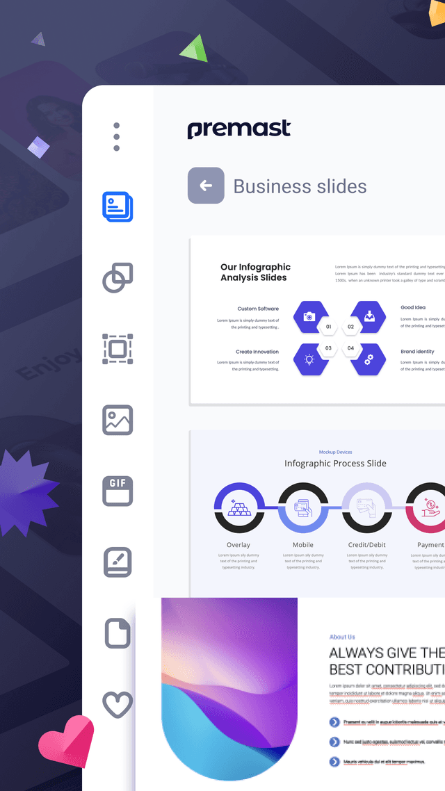
The second type of the infographic is informational from it’s name you can understand what it is about. Using it so you can summarize a long article or overview a topic. For example you can use it to tell what each department in your entity refleclts. It consists of headers with supporting points and related icons.
Simple as it is called timeline infograpic used to cover events and data overtime. As an example you can use it to tell the time line of a campaign or a plan that soon to execute. Usually it contains point explained in time like what happened when.
The fourth Infographic is about an overview instructions for a certain process. Explaining for example the steps of a process to develop your business. It is about numbers of steps with an explanation for each one.
In general infographic templates are totally useful to deliver information. Your presentation could be in a different level focusing on your content simplifying.
Some statistics that tell you why you should use Infographic if what we have told you is not enough.
- 90% of information sent to the brain is visual.
- 65% of people are visual learners.
- 30% of marketers use original graphics, such as infographics, more than any other type of visual content, including videos and GIFs
- Eye-tracking studies show internet readers pay close attention to information-carrying images.
- Infographics were the B2B content marketing tactic with the biggest increase in use from 2015 to 2016, up from 50% to 58%.
Spread the word
Start for free.
Design, manage and share your Presentation and branded content
