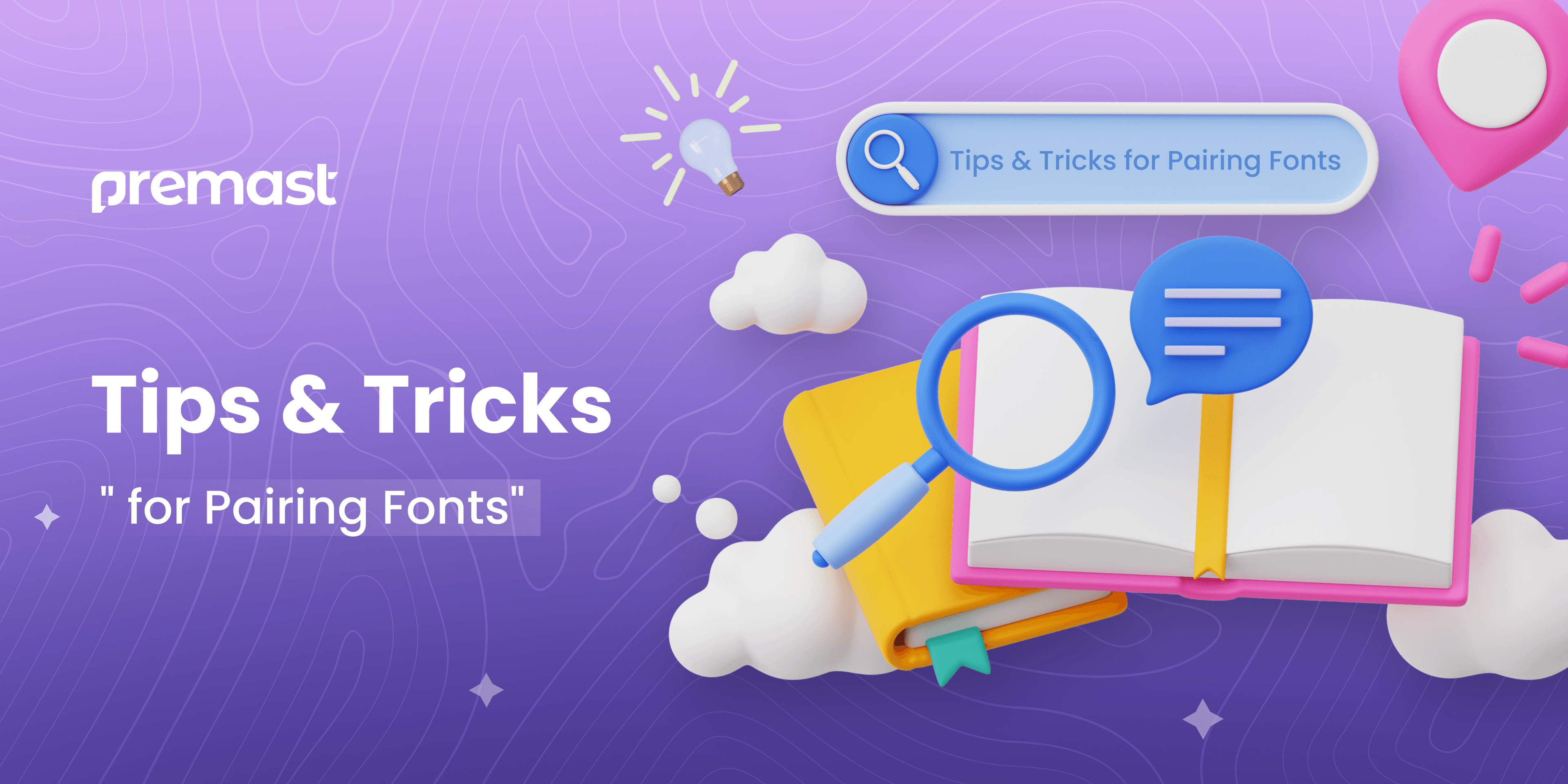
Tips & Tricks for Pairing Fonts
Have you considered that most clients tend to judge a project based on its visual presentation before delving into its actual content? Absolutely! It’s a challenge that designers constantly face. They must skillfully navigate the intricacies of typography to ensure a favorable design outcome.
If content is king, then typography serves as the regal red carpet. This analogy holds because typography permeates our surroundings, appearing in everything from online and print publications to books, websites, and everyday life. Its significance is undeniable across all contexts. As noted by Career Foundry, Typography transcends mere font selection; it’s a crucial aspect of user interface design.
Within typography, there’s often debate about defining two key elements. Who are these debaters? Let’s delve into the details.
Typeface Versus Font.
Typeface and font play crucial roles in typography, yet there’s often confusion about whether they’re interchangeable terms. They’re not. A typeface encompasses a range of fonts, each possessing its distinct mood and character, like Serif, Sans-Serif, Script, Blackletter, and Decorative.
Conversely, a font refers to a particular style within a typeface, characterized by its width, size, and weight. For instance, within the Serif typeface, you’ll find fonts like Times New Roman, Garamond, Georgia, and numerous others. Think of them as songs within an album – each font is like a track contributing to the overall collection.
Tips and Tricks for Font Pairing Part 1:
Typeface Understanding.
Typefaces can seem vast and intricate, yet they needn’t be. A small selection can yield a significant impact on our daily endeavors. Here, I introduce five fundamental typefaces for your initial understanding.
-
Serif Font.
Serif typefaces feature small feet at the end of their strokes. Among the most popular Serif typefaces are Times New Roman, Cambria, Cooper Black, Garamond, and numerous others. Serif fonts tend to be more ornamental, making them well-suited for headings and logos as they convey a sense of formality and credibility.
-
Sans-Serif Font.
Sans-serif fonts lack additional strokes. Well-known sans-serif typefaces encompass Helvetica, Avant-Garde, Arial, Geneva, and many others. This typographic style evokes a sense of informality, straightforwardness, and accessibility compared to serif fonts. They prove excellent for website content, blogs, and minimalist designs, fostering an air of humanitarianism and sophistication.
-
Scripts Font.
Scripts encompass letterforms inspired by human handwriting, exemplified by styles like Bistro Script, Shelly, and Minstral. They present a diverse range of moods and traits, spanning from formal to relaxed. Traditional Scripts lend an air of sophistication to invitations, announcements, and ornamental lettering, while casual Scripts are favored for advertisements, brochures, and any context desiring an informal appearance.
-
Blackletter Font.
Blackletter, also known as Gothic or Old English, features a rich, dense texture with intricately adorned capital letters. Examples of Blackletter fonts include Fette Fraktur and Engravers Old English. These fonts evoke an aura of spookiness, mystique, and classical elegance, making them ideal for book covers, movie titles, and CD packaging.
-
Display or Decorative Font.
Another style of handwriting is the Display or decorative typeface. Examples of Display typefaces include Morning Glory, Burnout, Carter Layered, and Pittsbrook. This category encompasses various tattoo fonts, graffiti-style fonts, and more. Display typefaces are ideal for E-Sport logos, drink or food labels, brand packaging, headlines, quote writings, and similar applications.
Selecting appropriate fonts significantly enhances the readability of our designs. Regardless of the quality of our content, sloppy font choices can make it appear unprofessional. Plum Grove emphasizes the importance of understanding factors that influence type readability. Scientists have identified five rules based on eye movement and comprehension, which should guide the selection of font and size for marketing materials.
To attract new clients without revealing our internal workings, we simply present professional content with impeccable typography. When our typography is polished, clients naturally place more trust in our work.
Tips and Tricks for Font Pairing Part 2:
Getting started.
Choosing fonts is similar to selecting color schemes; if they don’t complement each other, your design could appear uncoordinated. Therefore, aim to pair fonts from distinct categories to ensure a cohesive aesthetic. For Example, as mentioned below:
❌ Incorrect:

The above example demonstrates an improper font style usage. By employing a different style for both the heading and subheading, we can enhance their visibility and distinction.
✔️Correct:

Isn’t it a lot better? And, of course, matching these fonts needs some technical stuff, like:
Figure out how many different fonts you should use.
Searching for the ideal mix is key when sifting through numerous typeface libraries. In reality, there are no constraints on the quantity of fonts that can be utilized in a project. Even with ten fonts, a proficient designer can adeptly maintain visual harmony before progressing further.
Create Contrast between Fonts.
The following step is to determine the appropriate size ratio between the header and body text. As an example, the title employs a 24-point font, while the body text on the left side utilizes an 18-point font.
❌ Incorrect: ✔️Correct:

The size remains consistent, which complicates the reader’s task of pinpointing the crucial point.
A clear visual hierarchy is essential for delineating the sequence in which information is absorbed within our design. For instance, the header situated on the right side employs a 36-point font size for prominence, while the body text utilizes an 18-point font size, facilitating swift comprehension for readers.
Modify Font Thickness.
To establish a distinct visual hierarchy, adjusting font weights with varying degrees of boldness is essential. For example, using Roboto Light for both headers and body text doesn’t effectively differentiate them due to their similar thinness.
❌ Incorrect: ✔️Correct:

Alternatively, in the aforementioned example, it becomes evident that the optimal pairing emerges with Fredoka One and Raleway. Introducing a multitude of typefaces often results in a dissonant design.
Employ a Different Font That Shares a Similar Typeface.
Utilizing various fonts within the same typeface can be a time-saving method and result in a clean and straightforward aesthetic.
❌ Incorrect: ✔️Correct:

Avoid attempting to use a similar font, such as pairing Raleway Thin for both the header and body text. Doing so would be a clear example of a mistake.
Avoid Discordant Combinations:
Creating a positive impact is truly admirable, yet it doesn’t necessitate creating something clumsy. Our aim should be to cultivate visual coherence and fend off reader monotony. Integrating various fonts can be acceptable as long as we carefully consider proportions and heights.
❌ Incorrect: ✔️Correct:

An instance where Futura and Times New Roman don’t harmonize is due to their significant width contrast. Conversely, Chewi and Gudea complement each other seamlessly, exemplifying a perfect match.
Make it simple.
To ensure our design maintains clarity and aesthetic appeal, it’s essential to avoid pairing fonts with similar artistic styles. Doing so can result in a visually cluttered and difficult-to-read outcome. Instead, opt for a combination where one font is artistic while the other is more neutral or simplistic for the best results.
Blend With The Right Mood.
Pairing fonts effectively involves recognizing that each font possesses its own personality and mood. It’s crucial to avoid mismatching fonts with conflicting tones.
For instance, in the example provided, on the left side, Impact font appears bold and solid, whereas MTF Cool Kid exudes playfulness, simplicity, and a childlike charm. However, when combined, they create a jarring effect that can be displeasing to the eye.
Match Fonts According To Preferences.
Lots of folks don’t like paragraphs. But what if they’re the only way to share info? In that case, we need to learn to match fonts based on what we’re interested in, kind of like how headlines are organized in articles. We can make our project look different by using different fonts. For example, we can use a very bold font without any decorative lines, a lighter version of that font, and a bold font with decorative lines. This helps mix the styles of their designs and products.
Tips and Tricks for Font Pairing Part 3:
Additional knowledge to acquire.
Let’s integrate the tips and tricks mentioned earlier with the four fundamental concepts in typography: kerning, leading, tracking, and hierarchy. These elements will elevate our design experience. While we’re beginners, we don’t have to master every aspect of them immediately; rather, understanding enough to provide valuable references for all our design endeavors is sufficient. Take the time to familiarize yourself with these concepts gradually.
-
Hierarchy.
Utilizing hierarchy is a strategic method to guide the reader’s attention, directing them on where to start and proceed with the content they’re consuming. This involves employing various levels of emphasis effectively.
So, how can we put this into practice? First, determine the key points we want the reader to grasp initially, and then accentuate them by manipulating factors such as size, width, height, font styles, or other distinguishing features. It’s crucial to maintain simplicity throughout the process.
-
Leading.
Leading, or line spacing, is the space between lines of text. If you’re not sure how many lines to use, sticking to the default setting is usually fine. It’s important to avoid having too much or too little space between lines because it can make the text harder to read for people.
-
Tracking.
Tracking encompasses the entire space between characters and is commonly known as character spacing. In certain designs, we may fine-tune our tracking to achieve an artistic flair. Adjusting tracking can also be useful for correcting poorly spaced fonts.
-
Kerning.
Kerning refers to the specific spacing between individual letters, distinct from tracking. It adjusts the distance between characters to ensure a seamless fit. Achieving optimal spacing for each letter can be challenging. When dealing with a font lacking proper kerning, it’s advisable to opt for an alternative to avoid compromising the overall aesthetics.
Synthesizing All Components.
Mastering font pairing requires a keen sense of curiosity and an unwavering commitment to constant improvement. As our fascination with typography grows, so too does our drive to refine every aspect of our projects. Ultimately, skillfully executed typography has the power to elevate a design to extraordinary heights.
What are your thoughts on the Tips & Tricks for Pairing Fonts article?
We hope you enjoy delving into the fundamentals of typography. If this article piques your interest, don’t hesitate to explore our other enlightening pieces here.
Explore Premast for Free PowerPoint template downloads. Additionally, check out the Premast Blog to stay informed about the latest templates and gain design insights from our PowerPoint Experts!
Spread the word


Start for free.
Design, manage and share your Presentation and branded content