Mobile optimization goes beyond just making your website look good on a phone or tablet, it’s about ensuring it runs smoothly and provides a seamless user experience. A well-optimized mobile site loads quickly is easy to navigate, and keeps visitors engaged.
If your site isn’t mobile-friendly, users may struggle with slow page speeds, hard-to-click buttons, or confusing layouts. This can lead to frustration, higher bounce rates, and lost opportunities. A smooth and responsive mobile experience keeps visitors happy, encourages them to stay longer, and improves your search engine ranking.
Discover How to Make Your Website Mobile-Friendly.
Want to make your website more mobile-friendly? Here are some key strategies to enhance the user experience and boost engagement.
1. Use Responsive Design
Responsive design is essential for a mobile-friendly website. It automatically adjusts your site’s layout, images, and content to fit different screen sizes, ensuring an optimal experience on smartphones, tablets, and desktops.
2. Optimize Navigation
Mobile users prefer simple, easy-to-use navigation. Replace complex drop-down menus with a hamburger menu to keep your layout clean and organized. This makes browsing smoother and prevents clutter on smaller screens.
3. Make Buttons and Links Tap-Friendly
Small buttons can be frustrating on touchscreens. Increase button sizes and add enough spacing to make them easy to tap with a finger, improving accessibility and user satisfaction.
4. Improve Page Speed
Mobile users expect fast-loading pages. Optimize images by compressing them, reduce unnecessary scripts, and use caching to speed up loading times. A fast website reduces bounce rates and keeps users engaged.
5. Ensure Readable Text
Tiny text can be hard to read on mobile devices. Use legible fonts and maintain a proper contrast between text and background to improve readability without zooming in.
6. Enable Mobile-Friendly Forms
If your site has forms, make them easy to fill out on mobile. Use larger input fields, simple dropdowns, and autofill features to enhance the user experience.
By implementing these strategies, your website will be more user-friendly, leading to better engagement, lower bounce rates, and higher search rankings. A mobile-optimized site ensures that visitors have a smooth and enjoyable experience, no matter what device they use.
Optimize Your Design for All Screens
Responsive web design is essential for optimizing your website for mobile users. It ensures your site adapts smoothly to any screen size, providing a seamless experience on phones, tablets, and desktops. With responsive design, your content automatically adjusts to fit different devices, making navigation easy and user-friendly. This approach keeps your website looking great and functioning properly, no matter how visitors access it.
Optimize Images and Videos
Big images and videos can make your website load slowly on mobile devices. To keep your pages fast, optimize images by reducing file sizes as much as possible while keeping them clear and high-quality.
For videos, try using shorter versions or remove them if they’re not essential. This helps improve speed and gives visitors a smoother experience.
Check Your Website’s Speed and Performance Effortlessly.
Ensuring your website works seamlessly across different browsers and operating systems is key to providing a smooth user experience. Regular testing helps you spot and fix any issues before they impact visitors.
Using bug-tracking tools like Bugherd can simplify this process by automating issue tracking, keeping everything organized, and making it easier to manage fixes over time. With the right tools, you can maintain a high-performing, user-friendly website with less hassle.
Use Analytics to Track User Interactions.

Analytics is a powerful tool for understanding how visitors interact with your site on mobile devices. It helps you track which features users engage with the most, identify pages that need improvement, and see what content resonates best with your audience. By using these insights, you can optimize the mobile experience, boost engagement, and keep users coming back for more.
Enhance User Experience with Smart Design

Small details can make a big impact on how users interact with your website, especially on mobile devices. Make sure buttons and links are big enough to tap easily, preventing frustration and improving navigation. Using larger fonts also helps ensure your text is clear and easy to read on smaller screens. A smooth and accessible design keeps visitors engaged, making their experience seamless and enjoyable.
Make Sure Your Website Is Secure
Online security matters! Whether your visitors browse from a mobile device or a desktop, they’re exposed to potential risks. That’s why securing your website is essential.
Here’s how you can protect your site and visitors:
– Use an SSL certificate – Encrypt data to keep sensitive information safe.
– Enable two-factor authentication – Add an extra layer of security for logins.
– Keep software updated – Regular updates help block vulnerabilities.
A secure website builds trust, improves user experience, and even boosts SEO! Take these steps today and create a safer digital space for everyone.
Optimize Your Website with Mobile SEO Best Practices
Making your website mobile-friendly is key to reaching more users! Mobile SEO ensures your site is easy to find, loads fast, and looks great on smaller screens.
Use the right keywords, improve loading speed, and create content that’s easy to read on any device. Follow these best practices to keep your website optimized for both desktop and mobile visitors!
Keep Improving with User Feedback
Stay connected with your users and listen to their feedback! Regularly check in to see what they love about your mobile site and what could be better.
Their insights can help you make smart updates that enhance their experience. Small tweaks based on real feedback can make a big difference! By doing this, you’ll keep your mobile website user-friendly, engaging, and optimized for success.
Conclusion
To make your website mobile-friendly, focus on delivering a smooth user experience and staying updated with the latest trends.
By applying the tips above, your site will look great and work flawlessly on any device, ensuring a seamless and enjoyable experience for all users.
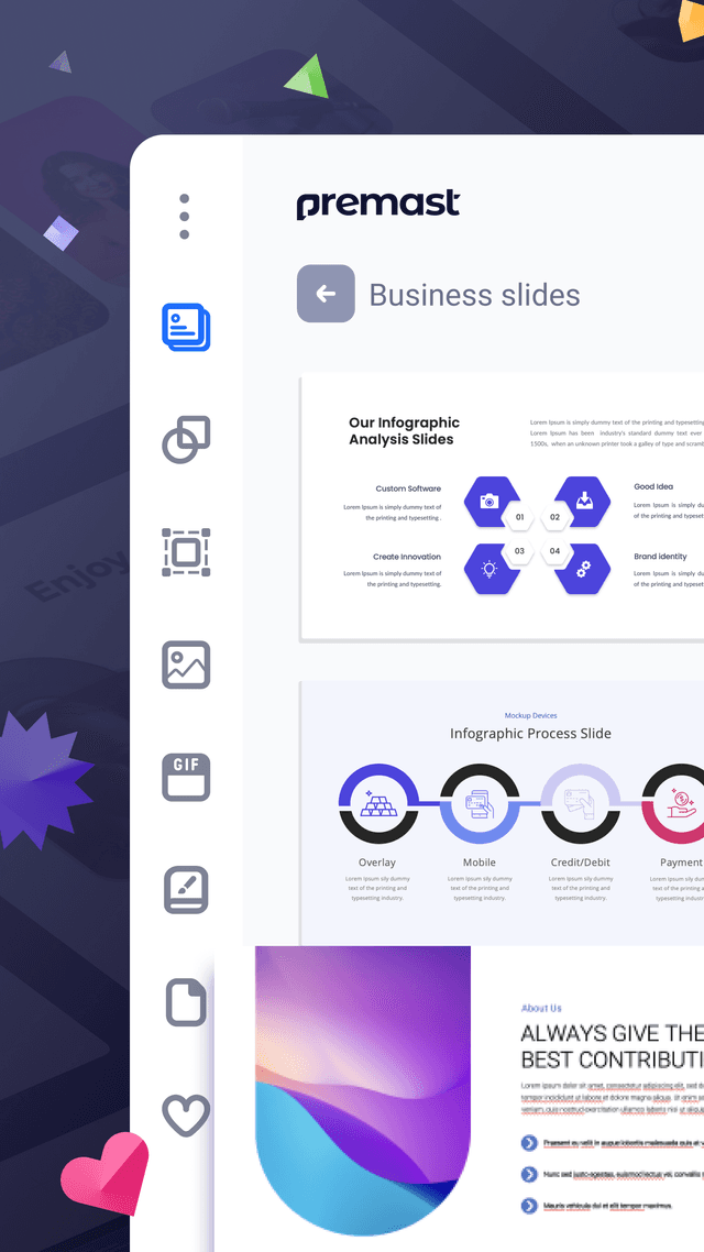
Let’s visit Premast to download free PowerPoint templates. You can also visit Premast Blog to keep up-to-date with new templates and get design tips from our PowerPoint experts!


